

A visitor who reaches your contact form has already done the hard part. They found you, read enough to be interested, and clicked through to the place where they could reach out. Then many of them stop. The form asks for too much, loads awkwardly on a phone, or gives no hint of what happens next, and the lead disappears without a trace.
That is why a lead generation form deserves attention before you spend more on SEO or ads. Every visitor you have already earned or paid for is worth more once the form works, and small changes to a form often do more than a new source of traffic. Our team sees this often when we look at business websites: strong pages, steady visits, and a form that quietly leaks leads.
What a Lead Generation Form Needs to Do
A lead form has two jobs that pull against each other. It has to make it easy for a visitor to reach out, and it has to collect enough information for you to follow up well. Every field you add helps with the second job and hurts the first. Good lead generation forms find the balance for your type of business.
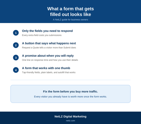
Start by deciding what you need in order to take the next step. A plumber needs a phone number and a short description of the problem. A law firm needs a way to reach the person and a note about their situation. A manufacturer wants a part description and a place to attach a drawing. If a field does not help you respond, it does not belong on the form. A lead form should read like the start of a conversation, not an application.
How Many Fields Is Too Many
The field count is where most lead capture form decisions go wrong. Shorter forms usually get more submissions, but a form that asks almost nothing can fill your inbox with leads you cannot qualify. The right length depends on how much a lead is worth to you and how much sorting you can handle.
For services where a call books the work, a name, a way to reach the person, and one open question is usually enough. For higher-value work with a longer sales cycle, a few extra questions about budget, timeline, or project type can save everyone time, and serious buyers will answer them. It also helps to keep the first step short and save the longer questions for a follow-up message or call, rather than putting everything in front of a cold visitor. Mark optional fields as optional, and skip the phone number field if you plan to reply by email.
A lead generation form template from a form builder is a fine starting point, but treat it as a draft. Templates ship with fields that suit someone else’s business, and trimming them down to what you need is usually the quickest improvement available.
Where the Form Sits and What Surrounds It
A form that is hard to find loses people before they ever see it. Put it where a visitor is ready to act: at the end of a service page, next to the explanation of what you do, and on a dedicated contact page. A short version repeated in a few places beats sending everyone to one buried page.
The words around the form count as much as the fields. A button that says Submit gives a visitor nothing. A button that says Request a Quote or Get My Estimate says what happens next. A single line about how quickly you respond, and a short note on how you use the information, removes two of the most common reasons people hesitate. If you look at lead form examples you have filled out yourself, the ones you finished were probably short, clear, and told you what to expect.
Watching how real visitors move through a page, including where they stop and what they skip, is one of the most reliable ways to improve website conversion, since it shows you which part of the form is causing the drop instead of leaving you to guess.
Forms That Work on a Phone
A large share of visitors reach your site from a phone, and forms are where mobile experiences tend to fail first. Fields that are too small to tap, a keyboard that shows letters when the field wants a number, a form that scrolls out of view when the keyboard opens, and error messages that appear off screen all push people to give up. Autofill works best when fields are labeled plainly, so use standard labels for name, email, and phone rather than creative ones.
Test your form on a real phone, not a resized browser window. Fill it out the way a customer would, with one thumb, and notice where it feels annoying. Those friction points are often fixable without a redesign. When a form keeps fighting the page around it, that can be a sign the site itself needs work, and a small business web design project is a better place to solve that than patching the form one field at a time.
Forms in Ads and on Landing Pages
Lead forms behave differently when the visitor arrives from an ad. Facebook lead ads, for example, open a form inside the app, which makes submitting easy and often brings more form fills, but the leads can be lower intent because the visitor never reached your website. Sending traffic to a landing page asks more of the visitor and usually brings fewer but better-qualified leads. Neither is always right. It depends on whether you would rather have more names to sort through or fewer, warmer conversations.
Whichever route you choose, the landing page should match the ad. Someone who clicked an ad for a specific service should arrive on a page about that service with the form in view, not on a general homepage. This is the part of PPC services that gets overlooked: the ad earns the click, but the page and the form decide whether it turns into a lead. A form built for a campaign also needs its own tracking, so you can tell which ad produced which lead.
What Happens After Someone Submits
A lead is only worth something if someone responds. The moment after a visitor submits a form matters as much as the form itself. A clear thank-you message that says what happens next and when sets expectations. A confirmation email gives the visitor proof the message went through. And a fast, human reply often counts for a lot, since people reaching out are frequently contacting more than one business at once.
This is also where form optimization becomes measurable. Track how many people reach the form, how many submit, and which page or ad sent them. Lead form optimization is far easier when you can see that one service page converts well while another does not, instead of guessing from a single total. Even a simple monthly count by source tells you where to improve.
What a Better Form Does for the Rest of Your Marketing
Better traffic is slow and expensive to get, and a better form is often neither. Before you add another ad budget or another round of content, spend an afternoon filling out your own forms on a phone, reading what they promise, and counting how many fields stand between a visitor and you. The fixes tend to be small, and they make everything else you pay for work harder. If you would like a second opinion on a form that is not performing, we are glad to look at it with you.